
Google Analytics Analytics with Python
17 Aug 2020Table of Contents
- Introduction
- Setting up Acces to the Google Analytics API
- Setting up your Python Project
- Loading your First Report
- Creating a Custom Report
- Example Reports and Visualizations
- Conclusion
- Resources
Google Analytics is a powerful analytics tool found in an astonishing number of websites. In this tutorial, we will take a look at how to access the Google Analytics API (v4) with Python and Pandas. Additionally, we will take a look at the various ways to analyze your tracking data and create custom reports.
Introduction
In this tutorial, we will be looking into how to load data from the Google Analytics API (v4) with Python. This tutorial is for those of you who already have Google Analytics running, so make sure that you have a website running Google Analytics and you had already some traffic on your site. To set up an analytics property on your website simply follow these instructions. If you have your Google Analytics property set up, you can access and view your analytics for your websites at https://analytics.google.com/analytics/web/. To quickly summarize, we will cover in this tutorial the following topics.
- How to set up access to the Google Analytics API (GA API)
- How to set up a Python project to access the GA API
- How to load your first report with Python
- How to create custom reports and explore what options we have with the GA API
- Finally, we will go over some further examples for some inspiration
Setting up Acces to the Google Analytics API
First things first: We need access to the data from Google Analytics. This requires us to use OAuth2 by creating a service account. The whole process to create a is well documented in the Reporting API Quickstart, but take your time as it takes a while to get through it. Here is a quick summary of the process.
- Create a project in the Google API Console by following the setup tool. There you will generate credentials which you can download as a JSON file and rename to
client_secrets.jsonwhich you will need later. Store this file in the project folder and keep it private as this is the access to your GA API account. Also copy the address of your service account email, which should have the formproject@PROJECT-ID.iam.gserviceaccount.com. - Now, go to Google Analytics main page and pick the web property you want to access with the API and open the Admin tab on top, got to the User Management section
- Next, you need to grant your service account access to your Google Analytics account. Click Add permission for, add the previous service account email and choose the type of permissions. Read & Analyze will do for this tutorial.
- Finally, Go to Google Analytics and select a view from which you want to import data. Click on the admin tab and copy the view Id, we will need this later.
Setting up your Python Project
Let’s take a quick look at the structure of your Google Analytics account, as it will become important in the next steps. Each Google Analytics account is made up of one or more properties. A Google Analytics property consists again of one or more reporting views. Finally, a Google Analytics view can be made up of several reports.
Why is this so complex? Let me explain. If you manage multiple companies you might need multiple accounts and you can have those accounts all under your main Google account. Each property are for each website that you have (if you want you can have multiple properties for a single website if you need separation). The key of the property (starting with UA-…) is the key you add to your website. Lastly, the views can be used for filtering and segmentation the data you are tracking. You will need one view which contains unfiltered tracking data and any other view can show some other user segment, or for example, users filtered from a single country of interest.
Now we are ready to install the Google Analytics API Client Library for Python. Additionally, you will need the oauth2client library for accessing resources protected by OAuth 2.0. Simply install the libraries with the following commands you should be ready.
pip install --upgrade google-api-python-client
pip install --upgrade oauth2client
Loading your First Report
Great, now we are ready to access Google Analytics with Python. Make sure that you have your client_secrets.json from previously ready in your folder. IMPORTANT: Be sure to add this file to your .gitignore if you use git and do not share this file. This file is used to access your Google Analytics account. You can view any access to your GA tracking data and manage your access credentials at console.developers.google.com.
Now get to the property that you have access to and get the View ID from the reporting View that you wish to access. Alternatively, you can use the Account Explorer to find a View ID. The following snippet gives us access to the GA API.
from apiclient.discovery import build
from oauth2client.service_account import ServiceAccountCredentials

SCOPES = ['https://www.googleapis.com/auth/analytics.readonly']
KEY_FILE_LOCATION = 'client_secrets.json'
VIEW_ID = 'XXXXXXXXX'

credentials = ServiceAccountCredentials.from_json_keyfile_name(KEY_FILE_LOCATION, SCOPES)

# Build the service object.
analytics = build('analyticsreporting', 'v4', credentials=credentials)
Let’s take a look at a simple report where we want to get the number of page views for each device category for the last year. In order to access the API, we need to provide the Oauth 2.0 scope, the key file location, and the View ID. This gives us a service object that allows us to access the API. Using this service object we can load reports by adding a request body as JSON, which defines what resources we want to collect. The minimum requirements for the request body are to have an entry for the viewId, an entry for the dateRange field and at least one entry in the metrics field.
The dateRange field is of the format YYYY-MM-DD and you need to have a start and end date. In this reference, you can see a couple of other options for the start and end date like today, yesterday among others. Note, that the end date is included in the range, so you could get for example all data for today if you specify 'startDate': 'today' and 'endDate': 'today'.
Additionally, we can add zero or more dimensions which can describe characteristics of users accessing your site. In this example, we are looking at the device category which can be either mobile, tablet or desktop. In the next part, we will take a closer look at what metrics and dimensions you have available. It is also possible to add multiple entries for reportRequests if you want to load multiple reports in one request.
response = analytics.reports().batchGet(body={
    'reportRequests': [{
        'viewId': VIEW_ID,
        'dateRanges': [{'startDate': 'XXXX-XX-XX', 'endDate': 'XXXX-XX-XX'}],
        'metrics': [
            {"expression": "ga:pageviews"},
            {"expression": "ga:avgSessionDuration"}
        ], "dimensions": [
            {"name": "ga:deviceCategory"}
        ]
    }]}).execute()
response
{'reports': [{'columnHeader': {'dimensions': ['ga:deviceCategory'],
    'metricHeader': {'metricHeaderEntries': [{'name': 'ga:pageviews',
       'type': 'INTEGER'},
      {'name': 'ga:avgSessionDuration', 'type': 'TIME'}]}},
   'data': {'isDataGolden': True,
    'maximums': [{'values': ['485', '94.95454545454545']}],
    'minimums': [{'values': ['29', '51.21186440677966']}],
    'rowCount': 3,
    'rows': [{'dimensions': ['desktop'],
      'metrics': [{'values': ['485', '51.21186440677966']}]},
     {'dimensions': ['mobile'],
      'metrics': [{'values': ['409', '69.30859375']}]},
     {'dimensions': ['tablet'],
      'metrics': [{'values': ['29', '94.95454545454545']}]}],
    'totals': [{'values': ['923', '60.06487341772152']}]}}]}
We can see that our response is a JSON file with a list of all reports. Each report includes the headers, the rows and also attributes like maximum, minimum and the row count. Note, that the attribute isDataGolden indicates if the exact same request will not produce any new results if asked at a later point in time.
This format is obviously difficult to work with, so let’s use a simple function adapted from the print_response snippet here to simplify the process of loading the data. In this function, we collect the data into a Pandas DataFrame. If you don’t know what Pandas is, it is a wonderful library for data analysis and it supports some useful visualization functions based on matplotlib.
import pandas as pd

def ga_response_dataframe(response):
    row_list = []
    # Get each collected report
    for report in response.get('reports', []):
        # Set column headers
        column_header = report.get('columnHeader', {})
        dimension_headers = column_header.get('dimensions', [])
        metric_headers = column_header.get('metricHeader', {}).get('metricHeaderEntries', [])

        # Get each row in the report
        for row in report.get('data', {}).get('rows', []):
            # create dict for each row
            row_dict = {}
            dimensions = row.get('dimensions', [])
            date_range_values = row.get('metrics', [])

            # Fill dict with dimension header (key) and dimension value (value)
            for header, dimension in zip(dimension_headers, dimensions):
                row_dict[header] = dimension

            # Fill dict with metric header (key) and metric value (value)
            for i, values in enumerate(date_range_values):
                for metric, value in zip(metric_headers, values.get('values')):
                # Set int as int, float a float
                    if ',' in value or '.' in value:
                        row_dict[metric.get('name')] = float(value)
                    else:
                        row_dict[metric.get('name')] = int(value)

            row_list.append(row_dict)
    return pd.DataFrame(row_list)
Using this handy function and Pandas, we can now visualize our previous report as a simple pie chart with just a few lines of code.
%matplotlib inline
import matplotlib.pyplot as plt
plt.style.use('ggplot')

df = ga_response_dataframe(response)
df.set_index('ga:deviceCategory', inplace=True)
axes = df.plot(kind='pie', figsize=(12.5, 6), subplots=True, legend=False)
df.head()
| ga:avgSessionDuration | ga:pageviews | |
|---|---|---|
| ga:deviceCategory | ||
| desktop | 51.211864 | 485 |
| mobile | 69.308594 | 409 |
| tablet | 94.954545 | 29 |
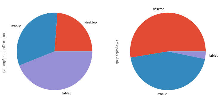
Neat! We can now immediately see that in this period of time are apparently a lot fewer tablet users, but they account for most of the session duration. Let’s see what else we can explore.
Creating a Custom Report
Armed with knowledge on how to load data from the GA API, we will explore now what other kinds of tracking data we can collect. We can assemble the reports in any way we want, using any metrics or dimensions we want. You can find the whole list of available metrics and dimensions in this reference. If we take a look at the Page Tracking box there, we can see a set of the various possible dimensions and metrics related to page tracking. One prominent metric we have used in the previous example was ga:pageviews which was collecting page views. The ga:deviceCategory dimension from the Platform or Device box was responsible for the categories in the previous examples. Other metrics include sessions with ga:sessions, users with ga:users among others. Other useful dimensions are ga:date, ga:city, ga:browser and ga:medium. But there is a ton of other, so make sure to explore the available metrics and dimensions for the use case you need. Make sure to take a look at the guide Creating a Report for more details and other options like filtering, ordering or segments among others.
![]()
There are also a few advanced features like pivot tables, cohorts or Livetime value which you can find in the Advanced Use Cases. A cohort is a group of users who share a common characteristic. The Lifetime Value report shows how user value (Revenue) and engagement (Appviews, Goal Completions, Sessions, and Session Duration) grow during the 90 days after a user is acquired.
Example Reports and Visualizations
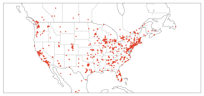
Here we will cover a few examples to get you up and running. Let’s say you want to visualize where people around the world access your website you can do this by using the ga:longitude and ga:latitude dimensions as in this example.
response = analytics.reports().batchGet(body={
    'reportRequests': [{
        'viewId': VIEW_ID,
        'dateRanges': [{'startDate': 'XXXX-XX-XX', 'endDate': 'XXXX-XX-XX'}],
        'metrics': [
            {"expression": "ga:sessions"},
        ], "dimensions": [
            {"name": "ga:longitude"},
            {"name": "ga:latitude"}
        ], "samplingLevel": "LARGE",
        "pageSize": 10000
    }]}).execute()

df = ga_response_dataframe(response)
df['ga:latitude'] = pd.to_numeric(df['ga:latitude'])
df['ga:longitude'] = pd.to_numeric(df['ga:longitude'])
df.head()
| ga:latitude | ga:longitude | ga:sessions | |
|---|---|---|---|
| 0 | 52.9789 | -0.0266 | 1 |
| 1 | 51.8104 | -0.0282 | 1 |
| 2 | 51.3762 | -0.0982 | 1 |
| 3 | 50.9990 | -0.1063 | 2 |
| 4 | 51.5074 | -0.1278 | 173 |
In this example we increased the sampling sizesamplingLebel to LARGE which accounts for a more accurate but slower response. For more details take a look at the guide. You will also notice that we added pageSize with 10000 which accounts for the number of rows. The default number of rows is 1000 rows and the maximum number of rows is 10000. If there are more results than set in pageSize you can paginate over them by using the nexPageToken value from the previous response and adding pageToken with this value. Refer again to the guide for further details on this.
After having our coordinates ready we can visualize them on a handsome map. The library we are using here is cartopy which is a handy package for geospatial data processing and visualization. The boundaries are based on the public domain map data set Natural Earth.
import cartopy
import cartopy.crs as ccrs

X = df[['ga:longitude', 'ga:latitude']].values

plt.figure(figsize=(12,68))
ax = plt.axes(projection=ccrs.Mercator())
ax.set_extent([-140, -40, 20, 55], crs=ccrs.PlateCarree())
plt.plot(X[:, 0], X[:, 1], '.', transform=ccrs.Geodetic())

states_provinces = cartopy.feature.NaturalEarthFeature(
        category='cultural',
        name='admin_1_states_provinces_lines',
        scale='50m',
        facecolor='none')
ax.add_feature(states_provinces, edgecolor='gray')
ax.add_feature(cartopy.feature.BORDERS, linestyle='-')
ax.add_feature(cartopy.feature.COASTLINE, linestyle='-')
plt.show()
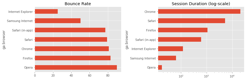
Great! Now in the next example we want to take a look at the bounce rate and session duration for each browser and compare those two. The bounce rate is a useful measure if you want to see how many people (in percent) exit your website after the first page they landed on.
response = analytics.reports().batchGet(body={
    'reportRequests': [{
        'viewId': VIEW_ID,
        'dateRanges': [{'startDate': 'XXXX-XX-XX', 'endDate': 'XXXX-XX-XX'}],
        'metrics': [
            {"expression": "ga:bounceRate"},
            {"expression": "ga:sessionDuration"}
        ], "dimensions": [
            {"name": "ga:browser"}
        ]
    }]}).execute()

df = ga_response_dataframe(response)

# Filter all entries with bounce rate of 100 and sessionDuration of 0
df = df[(df['ga:bounceRate'] < 100) & (df['ga:sessionDuration'] > 0.0)]
df.set_index('ga:browser', inplace=True)
df.head()
| ga:bounceRate | ga:sessionDuration | |
|---|---|---|
| ga:browser | ||
| Chrome | 81.176471 | 20470.0 |
| Firefox | 82.926829 | 1088.0 |
| Internet Explorer | 25.000000 | 120.0 |
| Opera | 90.000000 | 18.0 |
| Safari | 79.166667 | 5281.0 |
plt.figure(figsize=(12, 4))
plt.subplot(1, 2, 1)
df['ga:bounceRate'].sort_values(ascending=False).plot(kind='barh',
    color='C0', title='Bounce Rate')
plt.subplot(1, 2, 2)
df['ga:sessionDuration'].sort_values().plot(kind='barh',
    logx=True, color='C0', title='Session Duration (log-scale)')
plt.tight_layout()
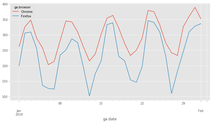
Suppose we want to analyze how many sessions were done on your website on Chrome and Firefox during a specified period of time. To do this, we use ga:date and ga:browser as dimensions which we then reshape with the Pandas pivot function.
response = analytics.reports().batchGet(body={
    'reportRequests': [{
        'viewId': VIEW_ID,
        'dateRanges': [{'startDate': '2018-01-01', 'endDate': '2018-02-01'}],
        'metrics': [
            {"expression": "ga:sessions"},
        ], "dimensions": [
            {"name": "ga:date"},
            {"name": "ga:browser"}
        ]
    }]}).execute()

df = ga_response_dataframe(response)
df['ga:date'] = pd.to_datetime(df['ga:date'])

# Filter for Chrome and Firefox browsers
mask = (df['ga:browser'] == 'Chrome') | (df['ga:browser'] == 'Firefox')
df = df[mask]

# Pivot table to have browsers as columns
df_plot = df.pivot('ga:date', 'ga:browser', 'ga:sessions')
df_plot.plot(figsize=(12, 6));
Conclusion
There you have it, this should set you up to work with the Google Analytics API with Python. We have covered how to set everything up to get it up and running. You have learned how to create reports and we have taken a look at how to make advanced reports. Google Analytics is a powerful tool and it gives useful insights where you can improve your website. Using this data you can fuel your data science pipeline to learn about your users and improve their experience with your site.
Resources
The tracking results from the website used in this tutorial have been altered for demonstration purpose.