 Image from Wikimedia Commons
Classifying the Iris Data Set with PyTorch
27 Sep 2020Table of Contents
- Data Preperation
- Visualize the Data
- Configure Neural Network Models
- Train the Model
- Plot Accuracy and Loss from Training
- Show ROC Curve
In this short article we will have a look on how to use PyTorch with the Iris data set. We will create and train a neural network with Linear layers and we will employ a Softmax activation function and the Adam optimizer.
Data Preperation
To prepare the data, we will use a StandardScaler to remove the mean and scale the features to unit variance. Finally we want to perform a train test split to compare our results later on.
import numpy as np
import pandas as pd
import matplotlib.pyplot as plt

plt.style.use('ggplot')
from sklearn.datasets import load_iris
from sklearn.model_selection import train_test_split
from sklearn.preprocessing import StandardScaler

iris = load_iris()
X = iris['data']
y = iris['target']
names = iris['target_names']
feature_names = iris['feature_names']

# Scale data to have mean 0 and variance 1
# which is importance for convergence of the neural network
scaler = StandardScaler()
X_scaled = scaler.fit_transform(X)

# Split the data set into training and testing
X_train, X_test, y_train, y_test = train_test_split(
    X_scaled, y, test_size=0.2, random_state=2)
Visualize the Data
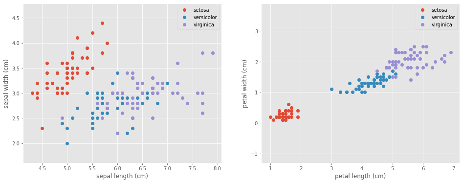
Let’s take a look at our data to see what we are dealing with.
fig, (ax1, ax2) = plt.subplots(1, 2, figsize=(16, 6))
for target, target_name in enumerate(names):
    X_plot = X[y == target]
    ax1.plot(X_plot[:, 0], X_plot[:, 1],
             linestyle='none',
             marker='o',
             label=target_name)
ax1.set_xlabel(feature_names[0])
ax1.set_ylabel(feature_names[1])
ax1.axis('equal')
ax1.legend();

for target, target_name in enumerate(names):
    X_plot = X[y == target]
    ax2.plot(X_plot[:, 2], X_plot[:, 3],
             linestyle='none',
             marker='o',
             label=target_name)
ax2.set_xlabel(feature_names[2])
ax2.set_ylabel(feature_names[3])
ax2.axis('equal')
ax2.legend();

Configure Neural Network Models
import torch
import torch.nn.functional as F
import torch.nn as nn
from torch.autograd import Variable
class Model(nn.Module):
    def __init__(self, input_dim):
        super(Model, self).__init__()
        self.layer1 = nn.Linear(input_dim, 50)
        self.layer2 = nn.Linear(50, 50)
        self.layer3 = nn.Linear(50, 3)

    def forward(self, x):
        x = F.relu(self.layer1(x))
        x = F.relu(self.layer2(x))
        x = F.softmax(self.layer3(x), dim=1)
        return x
model     = Model(X_train.shape[1])
optimizer = torch.optim.Adam(model.parameters(), lr=0.001)
loss_fn   = nn.CrossEntropyLoss()
model
Model(
  (layer1): Linear(in_features=4, out_features=50, bias=True)
  (layer2): Linear(in_features=50, out_features=50, bias=True)
  (layer3): Linear(in_features=50, out_features=3, bias=True)
)
Train the Model
Now its time to run the training. In order to track progress more efficiently, we can use tqdm, which is a great and easy to use progress bar for our training epochs.
import tqdm

EPOCHS  = 100
X_train = Variable(torch.from_numpy(X_train)).float()
y_train = Variable(torch.from_numpy(y_train)).long()
X_test  = Variable(torch.from_numpy(X_test)).float()
y_test  = Variable(torch.from_numpy(y_test)).long()

loss_list     = np.zeros((EPOCHS,))
accuracy_list = np.zeros((EPOCHS,))

for epoch in tqdm.trange(EPOCHS):
    y_pred = model(X_train)
    loss = loss_fn(y_pred, y_train)
    loss_list[epoch] = loss.item()

    # Zero gradients
    optimizer.zero_grad()
    loss.backward()
    optimizer.step()

    with torch.no_grad():
        y_pred = model(X_test)
        correct = (torch.argmax(y_pred, dim=1) == y_test).type(torch.FloatTensor)
        accuracy_list[epoch] = correct.mean()
100%|██████████| 100/100 [00:00<00:00, 407.99it/s]
Plot Accuracy and Loss from Training
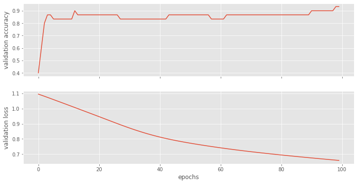
Let’s have a look how our models perform. We can clearly see that adding more nodes makes the training perform better.
fig, (ax1, ax2) = plt.subplots(2, figsize=(12, 6), sharex=True)

ax1.plot(accuracy_list)
ax1.set_ylabel("validation accuracy")
ax2.plot(loss_list)
ax2.set_ylabel("validation loss")
ax2.set_xlabel("epochs");

Show ROC Curve
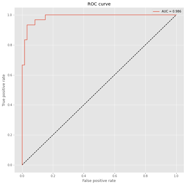
We have previously split the data and we can compare now with the Receiver Operating Characteristic (ROC) how well the models perform. The ROC plot compares the false positive rate with the true positive rate. We additionally compute for each model the Area under the curve (AUC), where auc = 1 is perfect classification and auc = 0.5 is random guessing (for a two class problem). To prepare the test data, we need to use the OneHotEncoder to encode the integer features into a One-hot vector which we then flatten with numpy.ravel() for sklearn.metrics.roc_curve().
from sklearn.metrics import roc_curve, auc
from sklearn.preprocessing import OneHotEncoder

plt.figure(figsize=(10, 10))
plt.plot([0, 1], [0, 1], 'k--')

# One hot encoding
enc = OneHotEncoder()
Y_onehot = enc.fit_transform(y_test[:, np.newaxis]).toarray()

with torch.no_grad():
    y_pred = model(X_test).numpy()
    fpr, tpr, threshold = roc_curve(Y_onehot.ravel(), y_pred.ravel())

plt.plot(fpr, tpr, label='AUC = {:.3f}'.format(auc(fpr, tpr)))
plt.xlabel('False positive rate')
plt.ylabel('True positive rate')
plt.title('ROC curve')
plt.legend();
